Staff writer Ethan Westmoreland discusses his opinion on different cereal mascots throughout the years.
Breakfast cereal is a fairly regular part of many people’s daily routine, but one question remains bold and unwavering even to this day: which cereal is the best? Proper advertising is important for any company; this is especially true for something like cereal. With hundreds of different variations and brands, it can be difficult to make a product stand out.
From Froot Loops’ Toucan Sam to Corn Pops’ Big Yeller, almost every cereal manufacturer has tried their hand at making a mascot. While some mascots take on a more direct advertising role, such as the sentient cereal pieces from the current ad campaign from Cinnamon Toast Crunch, other brand’s mascots, such as Frosted Flakes’ Tony the Tiger, are more tangentially related to their cereal. Though every mascot likely goes through similarly rigorous market testing, not all mascots are made the same. While some mascots stay in the mainstream, others are stuck in obscurity. For every Lucky the Leprechaun, there’s a Chockle the Blob. Though art is a subjective medium, there are still many tell-tale signs of a good mascot.
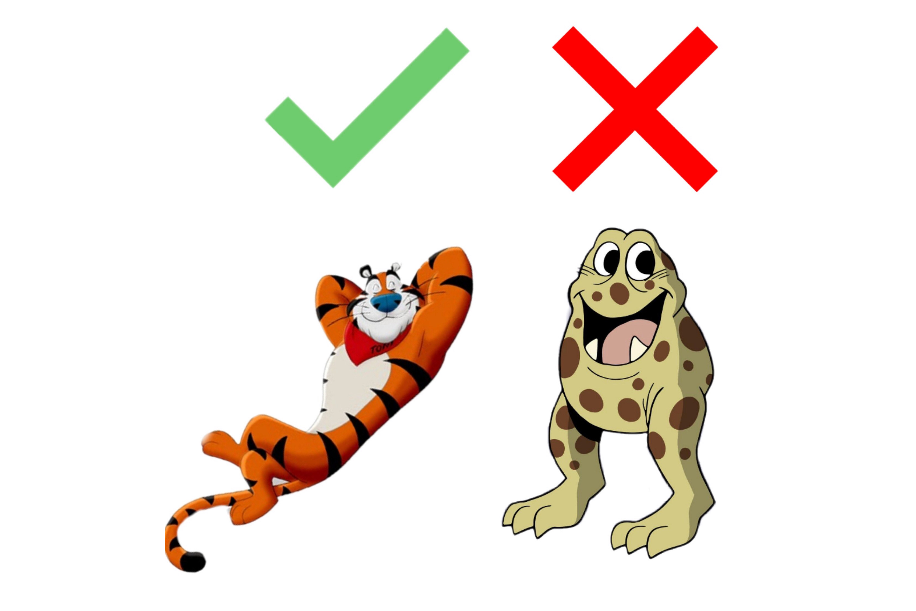
Tony the Tiger is a mascot that has stood the test of time. Since his creation by Kelloggs in 1952, he has undergone minimal design changes, retaining his signature red scarf and bright orange fur. So, why does Tony the Tiger work so well as a character? A key reason for Tony’s aesthetic quality is his color coordination. His design, not counting black or white, only has 4 colors. This allows for a great amount of visual cohesion and an overall well-rounded look. The large rounded shapes and clever color blocking allow Tony to be clear and defined and the scarf subtly separates his head from the rest of his body, giving his expressions more impact. The rounded shape of the character’s body makes him feel more relaxed and fun, rather than aggressive. Tony the Tiger, in my opinion, is a prime example of quality character design; his personality is expertly demonstrated through his color and shape. The warm color scheme and top-heavy proportions perfectly show the fun and sporty feel that Kellogs often aims for to market Frosted Flakes.
Chockle the Blob is a mascot remembered by few and liked by even fewer. In an attempt to branch out the Cap’n Crunch brand, Quaker Oats created Choco Cap’n Crunch. Chockle is depicted as a small, amphibian-like creature speckled with brown dots. While unconventional designs have worked in mascots before, such as the anthropomorphized Sun from Kellogg’s Raisin Bran, Chockle’s strange features come off as more disturbing than endearing. The decision to use a strange chocolate goblin as their mascot was likely a controversial one at Quaker Oats. The awkward proportions of Chockle are a big contributing factor to unsettling design; something about his massive, agape mouth can be deeply troubling and pairing him with the comparatively tame Cap’n Crunch only accentuates the strangeness of the creature.
Artistic design and fun marketing techniques are essential to selling breakfast cereal. In such a competitive market, standing out to your potential customers is essential which is why having a unique and well-designed mascot is so important.